The Banyan Review
Issue 21 of The Banyan Review, a digital literary magazine featuring poems, art, and short stories from both emerging and established artists. Read this issue and previous issues at: https://www.thebanyanreview.org

Ideal Odyssey
As life returns to a new normal after the previous years of quarantine and restricted travel, Andrew Jacobs resumes his life on the road meeting with clients and acquiring new ones. As he spreads his wings for this new adventure, he sets sight to branch out and build a location in Mexico.
The latest book in the series explores the concept of a journey with the cover featuring migrating Canada geese soaring through the clouds. On brand with the other books, each chapter contains unique motifs that pairs with the book's theme. This time the chapters alternate with different variations of a goose in flight, feathers, and clouds. The type pairings aim to capture the imperfect and rustic nature of travel


The Ideal Team
In 1921, Morris Jacobs opened Ideal Printing and Office Supply Corporation in New York. Flash forward to 2021, the company is renamed to Ideal Jacobs Corportation with the headquarters relocated to New Jersey. Andrew Jacobs celebrates the company's centennial by recalling his predecessors as well as reflect on how he and the company has changed in over the forty years he has dedicated to it.
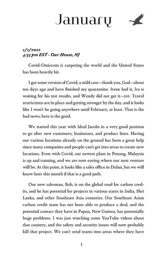
In line with the theme of "time", the design of this book aims to merge old with new with the font pairings and the clock motif. As each month goes by, the hour handle of the clock ticks in unison.


The Ideal Team
Tired of lockdowns and the pandemic, many people decided the summer of 2020 was a great time to pick up a new hobby. For some, it's dalgona coffee, others picked up bread making. New Jersey-based printing company, Ideal Jacobs, chose beekeeping. The Ideal Team, written by president Andrew Jacobs, documents his experiences with the first year of the novel coronavirus and how he and his staff deals with the challenges ahead, similar to their new team of friends.
The design of this book, also inspired by Mother Nature's pollinators is centered around the theme of bees. Its cover features a snapshot of the companies thriving colony paired with organic typography. The theme of bees carries throughout the book with hexagonal bullet points and stylized chapter headers. Each chapter of the book, titled by months, is introduced with a line art of a bee with scattered hexagons. As the months passes by, the amount of hexagons fluctuates similar to the building cycle of beehives.
Angela Davis: Seize the Time
This high school activity pamphlet shows the life of Angela Davis, exhibiting a private archive collection that will be displayed at the Zimmerli Art Museum along with educational activities reflecting how her story and influence remain relevant in the current political scene.
Rainbow Road
This project explores visual identity and how it can be applied to the branding of a business.
Rainbow Road is a made-up car livery design company with Pastel Pop as one of its product lines. The presentation shows how a consistent branding system can be applied to enforce a distinctive company standard, as well as how the branding can be communicated through different forms.
Invisible Cities (Abbreviated)
A typographic layout proposal of excerpts from Italo Calvino's Invisible Cities. To scale, the book prints as 4.25"x 5.5". The miniature design is inspired by the idea of a convenient carry-on book to accompany travelers' journeys. Included in the book is one passage about each city from the original novel and prefaces with a lecture by Calvino.

Natural Typography
A series of found letterforms from a vine near my house.


